Menu
close
Rebrand + Logo Design, Web Design and Collateral Development
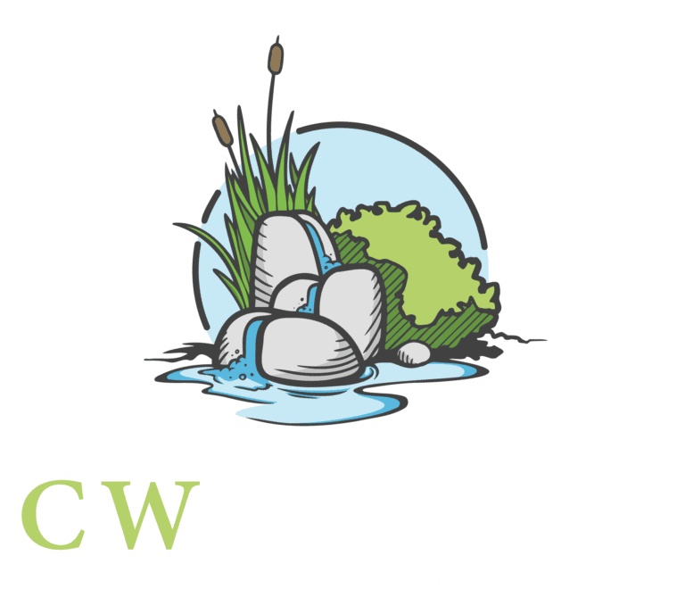
Natural, Friendly, Luxurious - The CW Designs brand combines a vibrant yellow/green with a neutral dark grey to induce a peaceful, energetic and luxurious color palette. The color usage of the logo mimics what you'd expect to see in nature, offering blues, browns and greys that compliment the primary color palette while they draw the eye toward the logo. When combined with the clean lines of the serif font the logo starts to take on a more glamorous feel while the illustrated logo maintains a level of approachability. The textural elements represent planning and professionalism while building an interesting and professional visual experience. The imagery compliments the contrast in the color palette while it focuses on a friendly and inviting perspective of outdoor spaces with a subtle inclusion of friends and family.


CW Designs, a renowned landscape renovation specialist, sought a comprehensive rebrand to enhance its market presence and align with its evolving vision and values. The project included a new logo design, brand identity, website redesign, collateral designs, and vehicle decals.
Our team collaborated closely with CW Designs to understand their goals, target audience, and brand aspirations. Through a series of workshops and feedback sessions, we developed a strategic approach to deliver a consistent and impactful rebrand.
Logo Design
Brand Identity
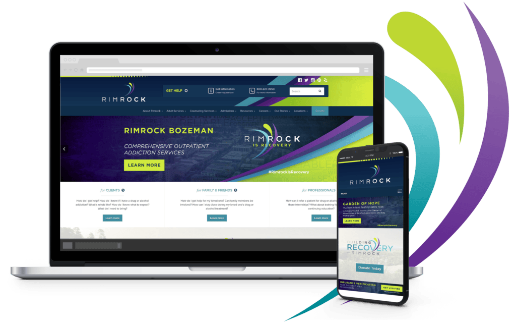
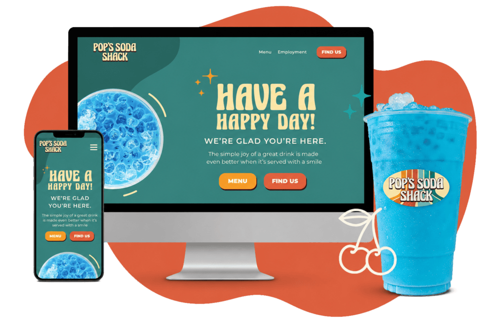
Website Design
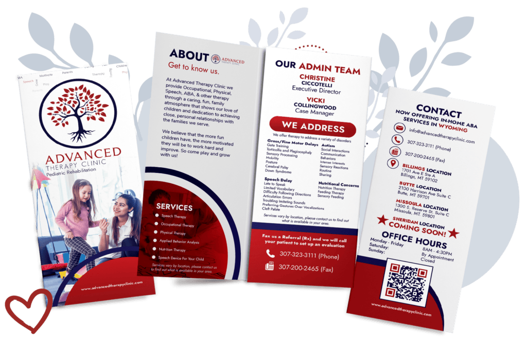
Collateral Designs
Vehicle Decals
The rebranding project successfully transformed CW Designs' brand presence, resulting in increased brand recognition and customer engagement. Key outcomes include:
The comprehensive rebranding project for CW Designs has positioned the company for continued growth and success. By modernizing its visual identity and enhancing user experience, CW Designs is better equipped to attract and retain clients in a competitive market.