Menu
close
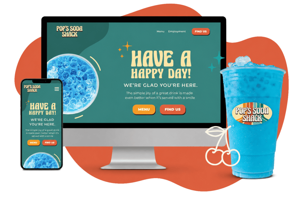
Brand Identity, Digital Marketing + Photography and Web Design
The Billings Sign Service brand uses a subtle saturated blue combined with a softer orange to create a modern color palette that's designed to help the viewer comfortably travel across the page. The angular shapes and clean lines are designed to mimic architecture while color palette evokes a more humble and dependable feeling.

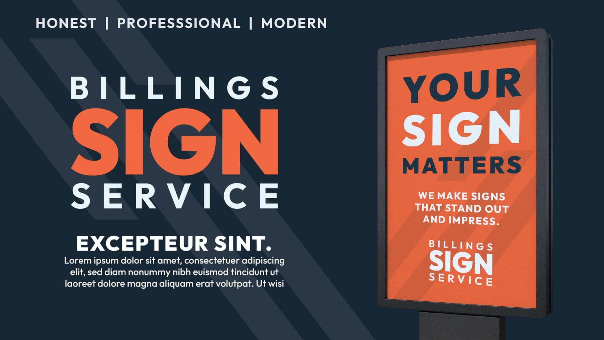


Billings Sign Service, a trusted name in the signage industry, approached us with a vision to revamp their brand identity and establish a strong digital presence. Our goal was to create a cohesive and visually appealing brand that would resonate with their target audience.
Our collaboration with Billings Sign Service resulted in a successful rebranding and digital transformation. The new brand identity, website, and photography have significantly improved their online presence, helping them attract new clients and solidify their position in the market.