Menu
close
Whether your business serves the Billings community or a much larger demographic, choosing the logo that's right for your brand is a process that shouldn't be taken lightly. You should choose the one that connects with your audience while remaining appropriate to your business, industry, and region. In this article, we aim to give you a little insight into the most common types of logos and how they can be used to build a unique and engaging brand experience.
Whether you're looking to create a logo for a new business in Billings or you're considering a rebrand, it's important to understand that each type of logo has its own unique pros and cons.
Here are the different types of logos we'll cover in this article:
An emblem is one of the most classic forms of logo design, which is why they're often thought of as traditional. The "traditional" perception doesn't mean they can't be awesome! Many companies are finding great success with this form of logo design by incorporating modern design elements and practices to invoke a feeling of trust and longevity.
Emblems as a standalone logo aren't always as flexible as some of the other types of logos. An emblem logo should be simple and clear. If it's too busy it will be difficult to reproduce across all branding platforms. For instance, emblem logos can become illegible on small mediums like business cards or when used on large mediums that are meant to be viewed at a distance.
But they are still an excellent choice for businesses that want a traditional look.
Monogram and letterform logos are among the most simple and easily recognizable logos. They feature a single letter or initials of a brand and are generally matched with a font or wordmark. Young brands should use these logos as a combination mark to ensure your audience associates the mark with your company.
Monogram logos often consist of multiple letters while letterform logos often consist of a single letter. This form of logo can also be used to serve as a secondary logo for things like profile images or favicons. Monogram logos are also considered to be a bit more traditional than letterform logos which are a more modern alternative.
Designing a unique monogram or letterform Logo can be tricky, but if done correctly, it can be easily recognized and memorable. While these logos are often highly versatile and can be easily reproduced, they're also very popular. Make sure you and your designer do enough research to avoid having a logo that looks similar to another brand.
Monogram Logo:
Letterform Logo:
Wordmark logos use a combination of the company name and a unique font to create a memorable and compelling brand experience. This type of logo works well when the company's name is short and unique. When designing this form of logo it's essential to use distinctive typography to avoid brand confusion.
Wordmarks can be used in various contexts such as business cards and social media. However, if they aren't designed properly, they may be difficult to use on small mediums. On the other hand, Wordmark logos incorporate the company's name so they tend to create immediate name recognition and are often the longest-lasting.
Legibility is a primary concern when designing a wordmark so hiring a professional designer with branding experience is essential. Wordmarks and logotypes are often more versatile and can change over time, which is useful for growing companies and adjusting to changing business needs.
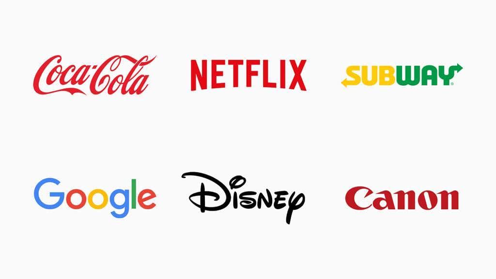
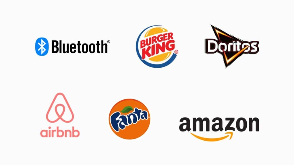
Logo symbols or pictorial marks are logos that can be expressed literally. These are often used in combination with a company's name to communicate the company's brand. Because the concept behind these designs can be complex, companies should be very careful when choosing a symbol.
The best choice for a logo symbol or pictorial mark is one that people can blatantly associate with a brand name and product. These symbols can be used to convey a deeper meaning and evoke a specific emotion. They work well for branding and often translate well to different cultures. Moreover, these brand marks tend to scale well.
Pictorial marks and logo symbols are two of the most versatile logo types. A brand can start by using both the text and the pictorial element in a single mark or use them separately for marketing purposes.
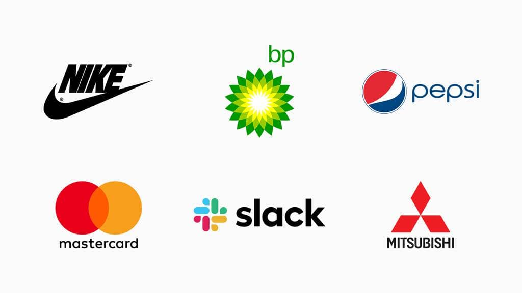
Abstract logo marks are unique symbols that do not necessarily depict a particular object or image but rather an abstract idea or ethos. They often convey a company's symbolism and can be visually appealing across cultures.
Since the purpose of abstract logos is to express brand emotions and not to imitate objects, they can be a bit risky and will likely require time to fully sink in. That being said, they can also be very effective and can be used across all types of branded merchandise and advertising campaigns.
Abstract logos are great for companies with a global presence. Designing the right abstract logo design requires a solid understanding of design principles. To avoid any misconceptions about the logo design it's important to gather feedback from a wide variety of cultures and perspectives.

When it comes to a creating logo for your brand, mascot logos are often exaggerated and designed to convey the personality of the brand. Mascot logos are a great way to humanize your brand and connect with customers.
The characters used in mascot logos can be almost anything but they should always display some sort of human characteristics. Mascots are known for being relatable and are great for businesses that want to illustrate their unique brand promise or experience.
Mascot logos are popular among all types of businesses. Whether you're a local small business or an international brand, mascots are a great way to make a lasting impression on your target audience.
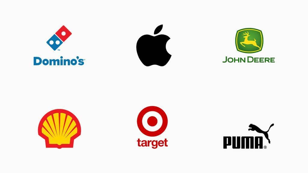
Combination logos are a popular choice for many businesses, many young brands start with a combination logo while they build brand equity. This form of logo combines several different types of logo design to create what is arguably the most versatile design choice.
Combination logos have the advantage of being highly customizable, hence boosting the chance of the customer remembering the brand. Because they give designers multiple variations of the logo they can be effectively reproduced on any medium. Although these logos of highly versatile they can also get diluted so it's important to build a strong brand design system when choosing a combination logo.
One of the most successful brand strategies for any business, whether in Billings or beyond, is to create a logo and then couple it with a strong brand identity, powerful language, and a clear image. A logo by itself isn't a brand but it's an essential part of a brand. In reality, it's all about how the logo is presented, using a solid color palette coupled with consistent typography, design elements, and imagery will greatly increase the effect your logo has on your audience.
*All logos used in this post are for reference only. Graphic Finesse makes no claim to having designed them.